A recent article in the SAS and R blog was about current winter temperatures in Albany, NY. The temperature data for the recent winter (Dec 2011 - Mar 2012) was plotted on a polar graph. Robert Allison posted an article on displaying the same data as a Polar Graph using SAS/GRAPH . Here is his code. Rick Wicklin also posted an article on Creating a Periodic Smoother showing the same plot on a linear x axis using the SGPLOT procedure.
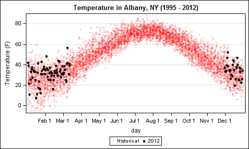
This article is about how we can display this data as a polar plot using GTL, and is there a benefit to such a presentation? I used Robert's code to download the data from the web and I created this simple graph of temperature by day of year on a linear axis with the recent values highlighted using the SGPLOT procedure:
Figure 1 - Linear plot using SGPLOT:
SGPLOT Code:
title 'Temperature in Albany, NY (1995 - 2012)'; proc sgplot data=linear; format day deg.; scatter x=day y=temp1 / markerattrs=(symbol=circlefilled size=3 color=red) legendlabel='Historical' transparency=0.8; scatter x=day y=temp2 / markerattrs=(symbol=starfilled size=5 color=black) legendlabel='2012'; xaxis values=(0 to 330 by 30) valueshint; yaxis grid label='Temperature (F)'; run; |
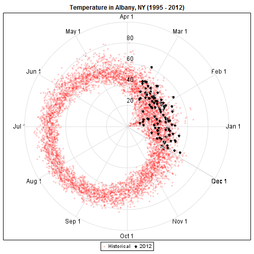
The same data can be displayed as a polar graph, by a simple transform of the data. Assuming the dayofweek is the angular axis, and temperature is the radial axis, we can compute the Cartesian coordinates, and plot it. I used GTL for this to maintain the aspect ratio of the graph with a Layout OverlayEquated.
Figure 2: Polar plot using GTL:
GTL Code:
proc template; define statgraph polar; dynamic _fit; begingraph / designwidth=9in designheight=9in; entrytitle 'Temperature in Albany, NY (1995 - 2012)'; layout overlay / xaxisopts=(display=none) yaxisopts=(display=none); scatterplot x=x1 y=y1 / markerattrs=(symbol=circlefilled size=3 color=red) name='a' legendlabel='Historical' datatransparency=0.8; scatterplot x=x2 y=y2 / markerattrs=(symbol=starfilled size=5 color=black) name='b' legendlabel='2012'; if (exists(_fit)) seriesplot x=xp y=yp/ lineattrs=graphfit; endif; vectorplot x=xr y=yr xorigin=xo yorigin=yo / arrowheads=false lineattrs=graphgridlines; scatterplot x=xl y=yl / markercharacter=deg markercharacterattrs=(size=10); scatterplot x=xel y=yel / markercharacter=semi markercharacterattrs=(size=10); ellipseparm semimajor=semi semiminor=semi xorigin=origin yorigin=origin slope=slope / outlineattrs=graphgridlines; discretelegend 'a' 'b'; endlayout; endgraph; end; run; /*--Polar plot--*/ ods graphics / reset width=5in height=5in noborder antialiasmax=6300 imagename='polar_GTL'; proc sgrender data=polar template=polar; format deg deg.; run; |
See full program attached below. In the template above, we have utilized the following features of GTL:
- Layout OverlayEquated to keep the graph shape round.
- ScatterPlots to plot the historical and 2012 data.
- SeriesPlot to plot the Fit line.
- VectorPlot to plot the radial grid lines.
- EllipseParm to plot the circular grid lines.
- ScatterPlot with MarkerCharacter to plot the values on the grid lines.
- The actual linear X and Y axes are not displayed.
- We used a Dynamic _fit to decide whether to plot the fit line or not.
- With a few small changes in the computation, you could start at the top and go clockwise.
For the average consumer, the trend of higher winter temperatures is likely easier to see in Figure 1: Linear Plot as compared to Figure 2: Polar plot.
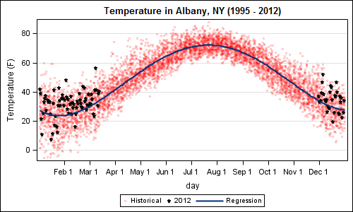
Rick discusses the use of a periodic smoother and how it can help us in deciphering the data. I took a simpler approach (probably will not stand up to expert scrutiny) and added a high-degree regression plot to the mix to get this graph:
Figure 13- Linear Fit plot using SGPLOT:
SGPLOT code:
title 'Temperature in Albany, NY (1995 - 2012)'; ods output sgplot=sgplot; proc sgplot data=linear; format day deg.; scatter x=day y=temp1 / markerattrs=(symbol=circlefilled size=3 color=red) legendlabel='Historical' transparency=0.8; scatter x=day y=temp2 / markerattrs=(symbol=starfilled size=5 color=black) legendlabel='2012'; reg x=day y=temp1 / degree=5 nomarkers lineattrs=graphfit; xaxis values=(0 to 330 by 30) valueshint; yaxis grid label='Temperature (F)'; run; |
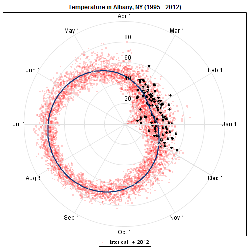
Now, to create the same polar plot with the predicted data, I took the simpler approach of outputting the data from the SGPLOT procedure step using the ODS Output statement. I transformed this data to create the polar representation using GTL as shown here:
Figure 4: Polar Fit plot using GTL:
GTL Code:
/*--Polar Fit plot--*/ ods graphics / reset width=5in height=5in noborder antialiasmax=6300 imagename='polar_GTL'; proc sgrender data=polar template=polar; format deg deg.; dynamic _fit='Yes'; run; |
Addition of the fit line in both graph improves in decoding of the data. Even here the simple linear graph seems superior in delivering the information with clarity. It is just easier for the eye to compare magnitudes when based on a linear representation from a common baseline, as is the case for the liner plot. The polar plot does not seem to add in any way to the decoding of the data.
There certainly are many use cases where the compass direction is important for understanding the data, such as the Windrose plot. However for periodic data, it may not always be better to display data in a polar graph.
Full SAS 9.2 code: Polar_V92


4 Comments
First of all: nice examples of what can be done. Good to know they're there when I'll make the switch from old SAS/Graph code ;-).
But imho the polar view does also show two phenomena that are not obvious in the line graph.
- Already in the first polar plot you can see that the variation in temperatures is greater in December, January and February (indicating also that a relatively warm winter statistically doesn't mean much). The line plot does show this as well, but it is more or less hidden because that part is divided between the left and right ends. A polar view does not have that problem.
- The fit appears not to be a circle (shifted towards the summer), but is bumped in during winter. In the graph view this will mean that the sinus is 'sharper' downwards then it is upwards, but that isn't easily visible.
Frank Poppe
PW Consulting,
the Netherlands
Pingback: Axis values and hint - Graphically Speaking
Pingback: Splines - Graphically Speaking
Pingback: Polar Graph - Graphically Speaking